Sunday, May 20, 2007

HSBC ADVERTISING

This week, I found an advertising of HSBC. This one drew my attention due to its compositional design. It is an image of number 1 which was combined of a group of people in red shirt looking up and smiling.


The composition that the designer created follows rule of unity/coherence.

The picture below is the original advertising. You can see that the number 1 is placed nicely apart from the remaining elements because of the proper use of negative space around it. As a result, the viewers feel peace to explore the rest of the advertising.


Sunday, May 13, 2007

T&D LOGO

In the previous post, I have mentioned about the MP logos that were designed by me as the need of reorganization for the products of my dad's company. The MP logos is planned to attach on the products importing to Russian market.

As, the company becomes larger, it's time for it to expand its market. I was asked to design another logo for products importing to American market. The logo is named T&D which stands for names of my uncle and his wife who are the main distributors/wholesalers in this new market.

The belowings are two snapshots of my final design; it has been registered and mass-produced.


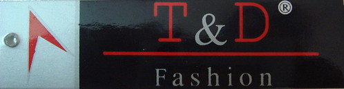
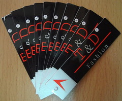
Let's talk a little bit about my design. I designed this logo based the same rule of logo design that I have mentioned in the previous post of MP logos. The general achievement is to make it as simple as possible and to increase maximum contrast to draw people's attention.

I chose red text laid out on the black background to achieve a simple and easy contrast. I also took advantages of the grey color in small proportions coming between red elements to create harmony effect of looking as well as make the logo look more luxurious when it's pressed plastic on.

Saturday, May 12, 2007

S2PHOTO

While surfing on the Internet, I found an interactive website. Why do I say so? It is because of its impressive design. It impressed me at a very first look. I can see some rule of composition I have learned in DIM 2 classes.

Here is the snapshot of the website
http://www.s2photo.cz/index_flash.html

According to the above snapshot, we can see that the designer have taken advantages of negative space to hightlight the colorful and playfull typography which is designed in two distinctive scale.

The navigations are placed nicely in the top left of the site let viewers explore more things about the site. As soon as the pointer is over the navigation, the huge centered text changes with a brief description under it before going farer for more details.

Monday, May 7, 2007

DON'T CLICK !!!

Click to perform action, to operate a program, blah blah, ... to make works more easy. This is such a very usual work that almost everybody does everyday when woking with a computer. Imagine that one day, we cannot click ... huh ... horrible.However, don't you know that work can be more interesting without ... cliking. That's the message that dontclick.it want to share with us. Let's experience this site and have fun.


I post this blog as an example for the lesson of interactivity that we have been introduced in this course. Through this site, we can see one brilliant way to interact and communicate with viewers.

Sunday, May 6, 2007

APLLYING THE RULE of THIRDS

The rule of thirds is a basic and popular rule used mostly in photography . The background behind it is to reach an easy balanced composition or to avoid symmetric one which is usually boring.

One easy way to practice the rule is to divide an image into thirds both in horizontal view and vertical view by imagery lines. The intersections of these lines create 4 points called crossing points. We placed important objects here to attract people's attention.

The following exanples are 2 good examples:

Example 1: The image is divided into 2 separate areas; one occupies 1/3, the other takes 2/3 of the whole image.


Example 2: This image takes advantage of a crossing point to create constrast and reduce "boring" empty space. The object here is a small wooden house and plays part as "an anchor for a first look and invites to a further observation of the scene".


References: RULE of THE THIRDS, http://www.photozone.de/4Technique/compose/third.htm

Sunday, April 15, 2007

BOOK COVER_DIRTY CASH


This is the cover of the novel named "dirty CASH" that I designed for assignment 3b of DIM 2 class. Take a look at it and give me some comments. I'll appreciate all of your kindly comments ^^

Friday, April 13, 2007

BALANCE

Reflections are some of great examples of forming balance in images.

Belows are some examples that I found on the Internet to have a deep look at balance in composition.

http://farm1.static.flickr.com/206/458402718_4a58585b26.jpg?v=0


http://www.flickr.com/photos/jpghouse/458428449/


http://www.flickr.com/photos/annkelliott/458402770/

http://www.flickr.com/photos/annkelliott/458402746/

The above images are not my work. It's just some of examples I found on the Internet to get the idea before actually capturing some by myself ^^

WEB DESIGN

This week, our group has made a presentation on a topic about WEB DESIGN. I posts this blog to check and summarize my understandings about this subject, as well as let other people who access my blog know more about how a commercial or an information websites are designed.

There are many types of websites. Depend on the way the website is design and the purpose why a website is publicized, we can categrorized them into 3 kinds of websites:

1. Personal websites
2. Commercial websites
3. Information websites

Personal websites are those that is non-professional and mostly are designed by 1 person or a group from 2 to 3 people. They makes their sites for a variety of different purposes. Some makes it for fun, others makes it to keep in touch with their friends and family. These sites usually contains their information, and their thoughts about life, friends, shcool, etc.

Commercial websites and Information websites are more professional and designed. Commercial websites are ones that are made up by a company or an organization to sell their products or encourage people to use their services. Information websites, however, are made up to give the viewers mainly information not only about themselves but also about other ones (happening in the world :))).

Commercial websites use a lot of graffic for their design, and their designs are based on the theme of the products or services they provide.

Followings are some images of commercial websites:

http://www.oneill.com/


http://www.imagestation.com/


http://www.icoke.hk/csol/00_csol_shell.jsp


When people access an information website, they mostly gotta read long articles of information. Most of the sites take advantages of using primary colors together with black and white to reach an obvious and simpliest contrast. As a result, people don't feel tired when read many long articles.

Belows are some images of well-known information websites:

http://news.bbc.co.uk/


http://www.tuoitre.com.vn/Tianyon/Index.aspx?ChannelID=16


http://vnexpress.net/Vietnam/Home/

MP LOGOS

Background

My father has been operating a small company which produces a variety of clothes. The main market for the company is Russia. All of the products are transported to Moscow through the ocean by big container ship.

The need of a logo

The company has been operated for several years without caring about the identity of the company. All of the products were attached with marks of some other famous companies like adias, Nike, etc. Since Vietnam joined the WTO, such the products are not allowed to get exported. Therefore, the company needs to create a trademark, logo, etc. to get it identified and be able to get exported.

Response

I was asked to design a logo, a trademark for the company. It was such a difficult work because I had no experience about this. The only things I had was some concepts of design that I was introduced in class and amateur Illustrators skills. I got lots of questions at that time, how my design should be, which colors I should use, about shape, ideas, etc.

The best ways to solve the issue was to do research some other known company's logos. I did it :D (just to have the ideas, not to copy ^^). I recognized that most of the logos (in clothes industry) don't use lots of colors and are simple shapes. The colors of red, blue, black and white were used mostly. This made sense in terms of hue contrast in the theory of color of Johannes Itten. He has said about primary colors that "If you separate the colors by white and black, the individual colors will become stronger, but as a group the contrast is weakened." This was such a great meaningful statement and I have created the logos in response to the concept.

Result

Following are my final designs; I have taken advantages of red color separated by black and white to reach the simplest contrast for my design.

Logo 1


Logo 2


Logo 3


All of the designs above have been registered and play as the trademark of my father's company so that don't try to copy it ^^

Monday, April 2, 2007

Theory of color

In DIM2 class, I have been introduced a lesson about theory of color. This was such a interesting lesson. In response to this lesson, I have searched some examples on the Internet to extend my knowledge on this lesson. Thanks to Google searching engine, I have found a really good site giving all well organised information about this particular subject. I posted this blog attached with the link to this site so that some of you can get a look at it :). Enjoy and feel free.

This is the link http://www.artsconnected.org/toolkit/encyc_colorwheel.html

Wednesday, March 28, 2007

MY LOGO


This is my logo.
You may wonder why I designed such a logo.
My name is Quan mean King in Vietnamese, so I drew a Q letter looks like a face of a King :)~.
I placed the face on the green oval for 2 reasons.
First, the oval and the "Q face" resemble my eye (human's eyes in general ^^) means that "always look forward looking for something new in life (in design also :)))".
I chose the green color for the oval because this is a color of nature, balance, hope and recovery.