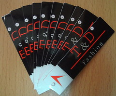
As, the company becomes larger, it's time for it to expand its market. I was asked to design another logo for products importing to American market. The logo is named T&D which stands for names of my uncle and his wife who are the main distributors/wholesalers in this new market.
The belowings are two snapshots of my final design; it has been registered and mass-produced.


Let's talk a little bit about my design. I designed this logo based the same rule of logo design that I have mentioned in the previous post of MP logos. The general achievement is to make it as simple as possible and to increase maximum contrast to draw people's attention.
I chose red text laid out on the black background to achieve a simple and easy contrast. I also took advantages of the grey color in small proportions coming between red elements to create harmony effect of looking as well as make the logo look more luxurious when it's pressed plastic on.
No comments:
Post a Comment